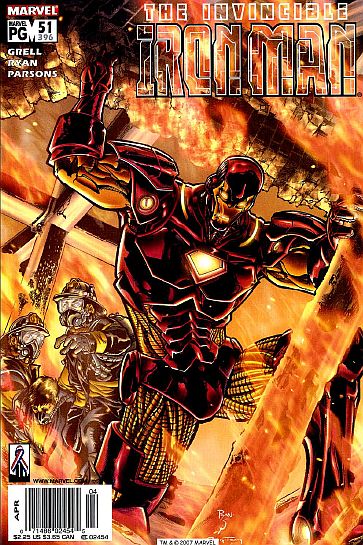
IRON MAN vol. 3 #51 (396)
(April, 2002) "Jane Doe."
Cover art: Michael Ryan.
Script: Mike Grell.
Art: Michael Ryan/Sean Parsons.
This issue begins with a "Pretty Woman"-esque scene with Tony Stark driving his sleek auto through a seedy area of town, and picking up a .... hooker?? Yep. However, Tony is playing the "save the world" type here as he takes Shelly (the hooker) to "The Haven" -- a safehouse for troubled youth. He leaves Shelly to the care of Haven's honcho, one Abby St. Clair. Why? Because Tony has to get to a conference which is dealing with how to best make use of the new markets that have opened up in Central Europe since the fall of Milos Radanovich (see last issue). We're treated to introductions of several new characters (too numerous to mention) while the panels segue back and forth between the conference and a discussion among Shelly and Abby back at Haven. Stark realizes he left his briefcase (no, not the one with the armor in it, but a real briefcase) at Haven, so he asks Abby to bring it to the conference. She nevers makes it. She somehow gets trapped in a burning building -- but it looks like Iron Man will save the day -- and Abby, too! But wait -- Iron Man is low on power, and the heat of the building is getting too hot for his armor??? Hooooo-boy.
Grell makes good use of Tony's philanthropic nature with "Haven" and Shelly by having Abby explain to Shelly why Tony isn't "just another rich guy trying to assuage his conscience" -- he's been through the gutter himself. The intro of new characters intertwined with new business opportunities is interesting, as well. However, Grell obviously hasn't done much research on Shellhead's armor. Hell, back in the '60s IM had a thermocouple that could draw energy from flames/heat! Even the 1980s' Red and Silver armor withstood an A.I.M. gigawatt plasma beam! So, having a mere burning building endanger Shellhead is specious, at best. My opinion of Ryan's art hasn't changed since last issue. In other words, lose Parsons and I think it'll be better.
Hube's Recommendation: 2 1/2 repulsors!
Fan Reaction: Dear Hube -- I stopped collecting Iron Man just after the conclusion of the "Dragon Seed" saga. Lately I've been sorely regretting the move and have subsequently resumed collecting Iron Man, the super hero with real ultimate power. I've been sorely dissapointed. Both issue 50 and 51 are really bad! Tony Stark looks like a meat-headed moron, not the world class genius slash specimen-of-physical-superiority I recall. The suit itself looks cool but it has become overburdened with mad stupid junk! Why does the helmet have a scowl on it? Is that supposed to look tough? I think it looks retarded. Grell's storyline's and dialogues are soap-operishly simple-minded, and Ryan's art is cartoony crap. If I were you I would give issues 50 & 51 both negative two zillion and a half repulsors. Keep up the good work :) -- neo815

